Print Design
Fisher Scientific - Lean Lab
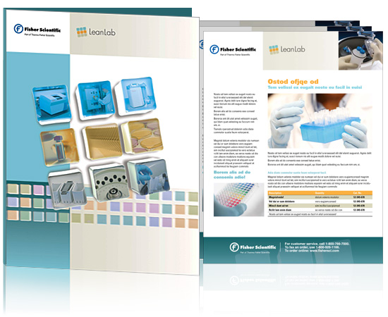
The Marketing and Communications group was approached to do a new design for a Lean Lab concept where Fisher Scientific pulled from the vast inventories of products to present recommended options in Equipment, Materials and Accessories.
When I designed to this theme, I thought of a nine cube matrix, tilted as if pulled from a stream of options. The nine cube matrix became part of the logo and design.
I kept the colors light, clean, and cool to represent a lean, healthy, friendly look, and the typography in the logo reflects that as well.